The Member Story
Four numbered questions, a seated member, a lapel mic, and enough silence to let someone actually think. Built once in early 2024, then re-run a year and a half later on a competitive swimmer, same architecture, different body. The signature format, and the one that pays off deepest: these engage around twice a normal post, without chasing reach.
1:14
1:35
The member-story format engaged around twice the account's typical post, and four times on its first outing, the muscle-up interview. It under-indexes on views and over-indexes on the thing that matters for a gym: people stopping to watch a whole person answer why they started.
The Bit
Coaches as talent. The first is a nine-second trend skit; the second is scripted, cast and shot in a real venue, with chat-bubble UI composited over live action and a title card that borrows from SpongeBob. Comedy is the reach play, the piece that opens the account to people who don't follow it yet.
0:09
0:31
The no-warm-up skit was viewed 2.6× and reached nearly 1.9× the account's normal reel, the widest a piece travelled in the whole run. Comedy buys reach; the scripted follow-up proves the same format can also direct a performance and build the graphics.
In the Room
The content that gets forwarded and saved, real members, on location, at night. An obstacle race, a women's vox-pop that reads calisthenics against its own stereotype, an iftar gathering, and a partner challenge that ends by asking whether you're up to it. This is the social proof a price list can't describe, and it's the stuff that travels.
0:18
0:24
1:22
0:10
Event coverage is made to be sent to a friend: the Tough Mudder cut was shared roughly five times more than a typical Cyborg post. The iftar was saved twice as often, and the partner challenge shared 2.4×. Belonging, quantified.
The Offer
Where the video meets the design. Two offer reels that got saved and shared to act on later, then the carousels, a slideshow with a sales structure hidden inside it, run for three Ramadans in a row on one deliberately narrow system: condensed italic caps, red on black, hook → value → offer → urgency → CTA. Direct response, executed as design.
0:16
0:49
An offer is something people save to come back to, the Welcome Week reel was saved five times the baseline, the Trio offer shared 3.8×. Then the same job, in still frames: three carousels, three consecutive Ramadans, one design system that holds them together as a recurring property.
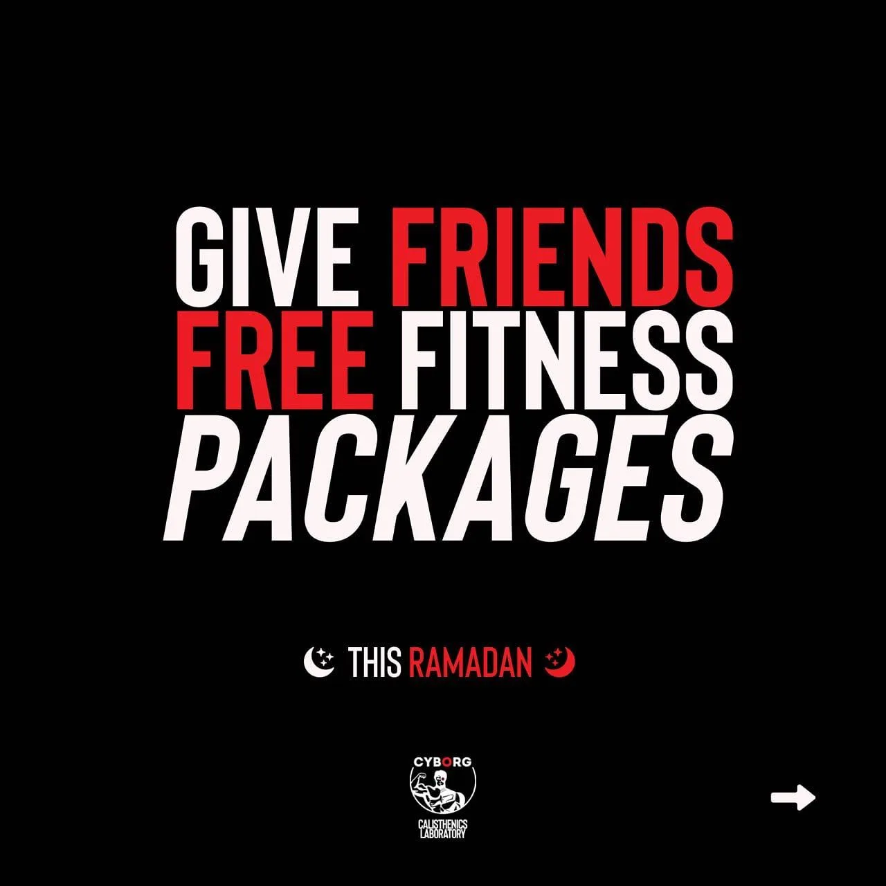
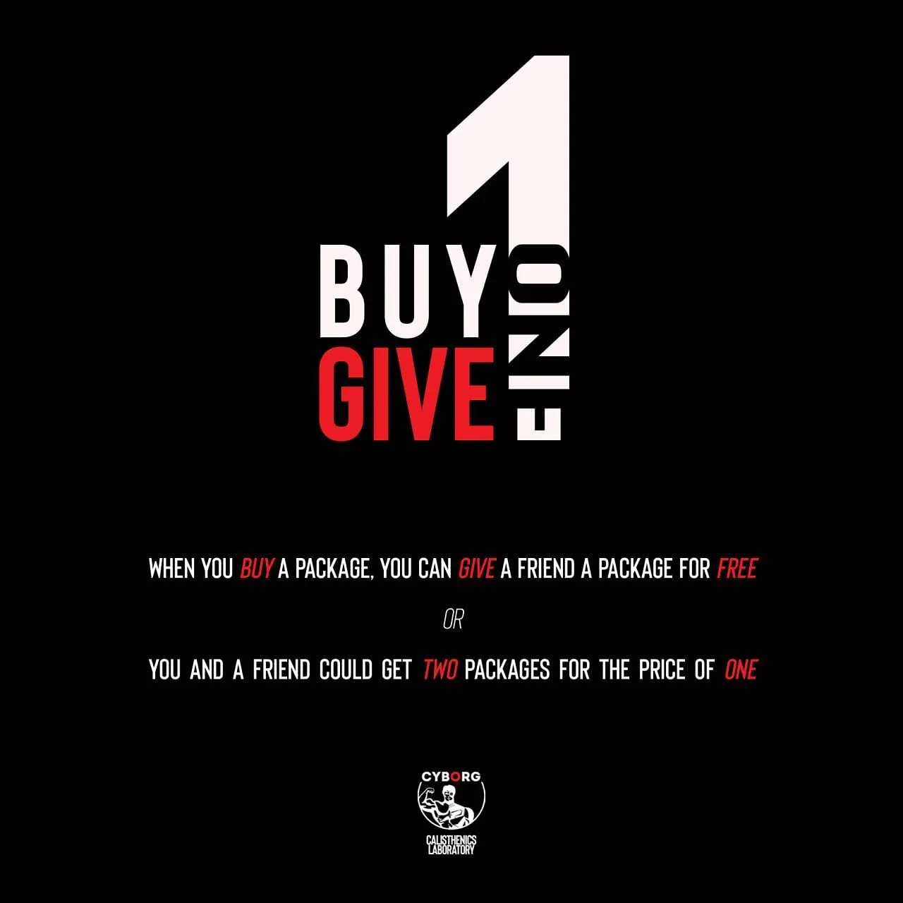
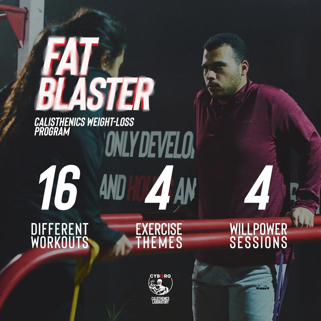
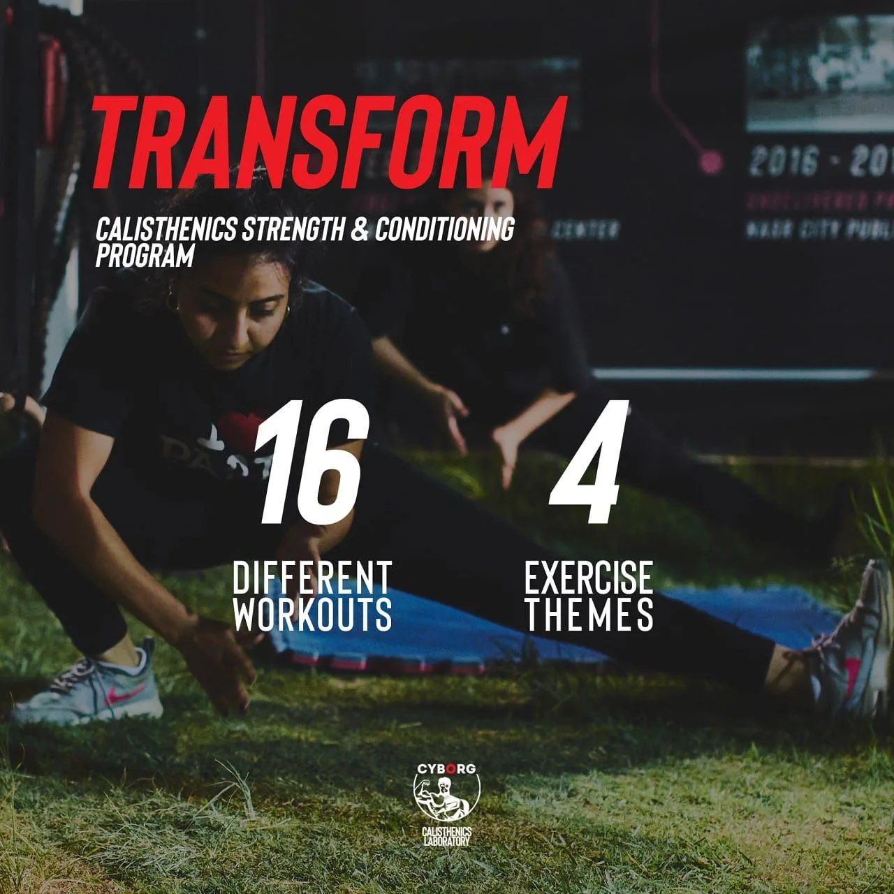
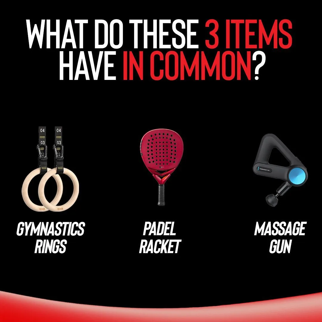


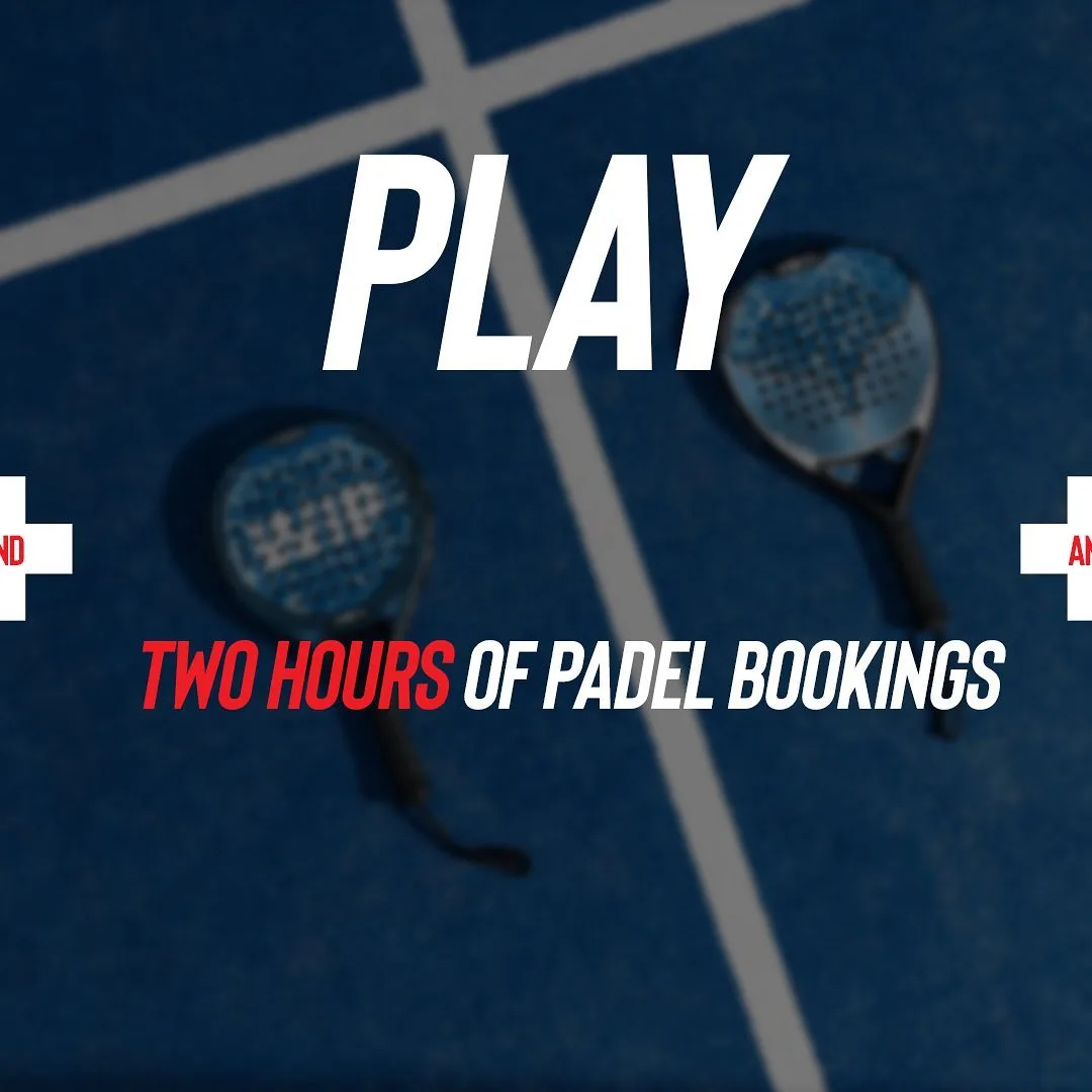


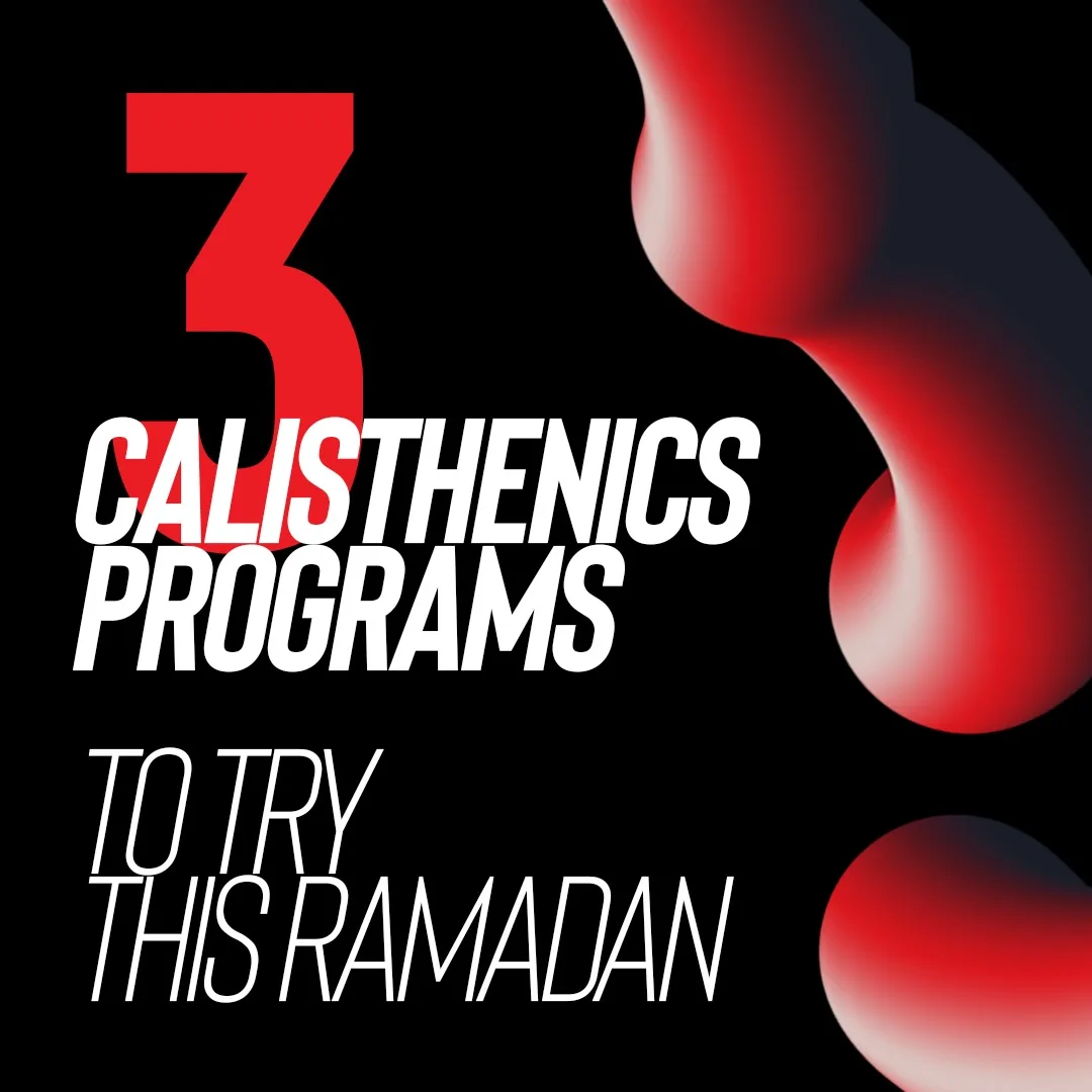
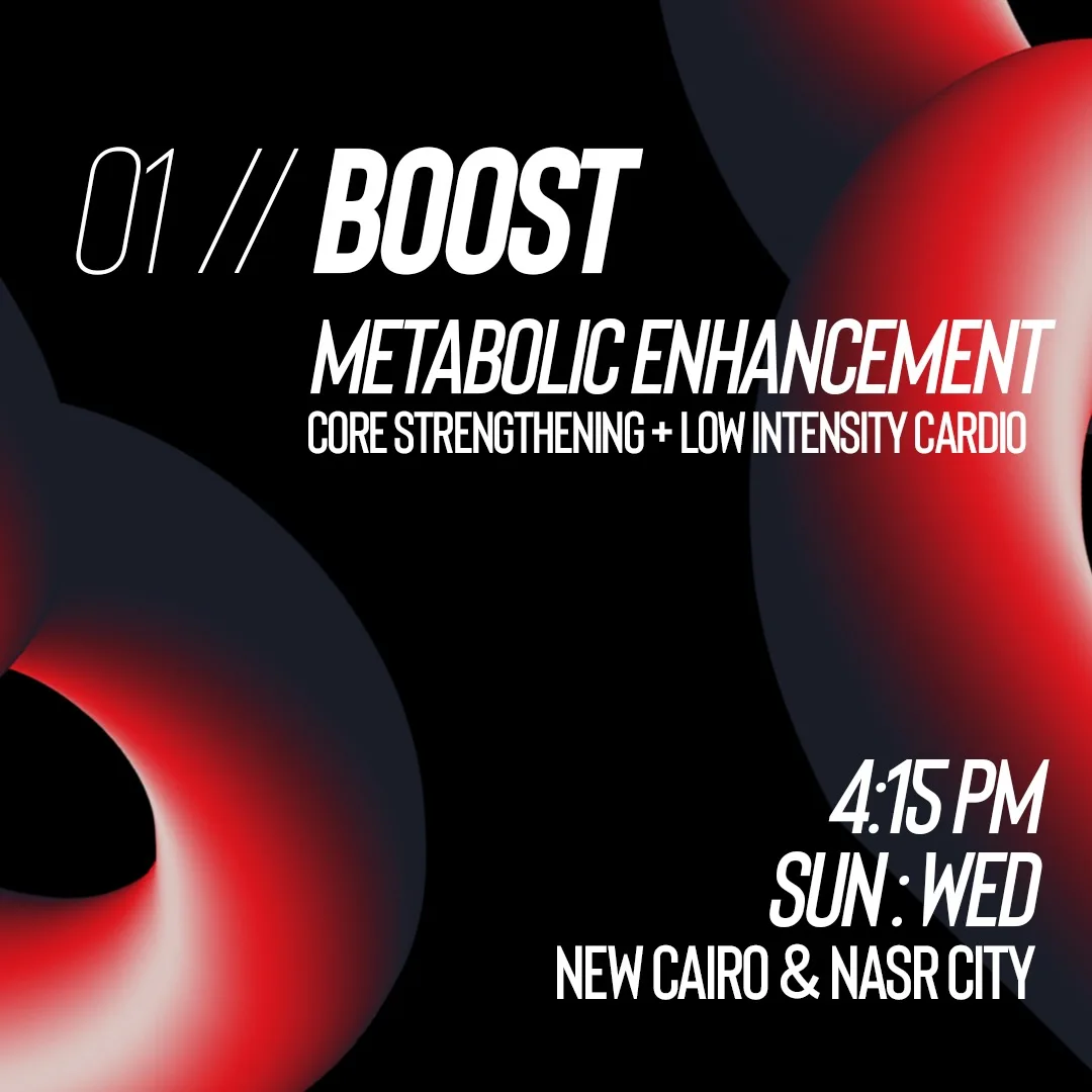
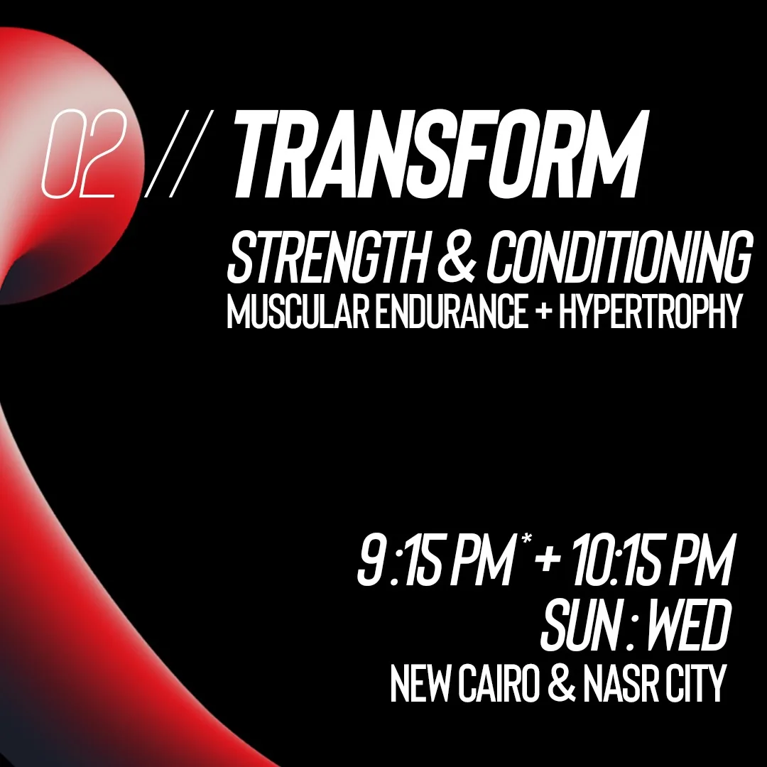
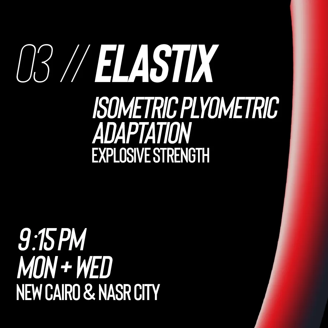
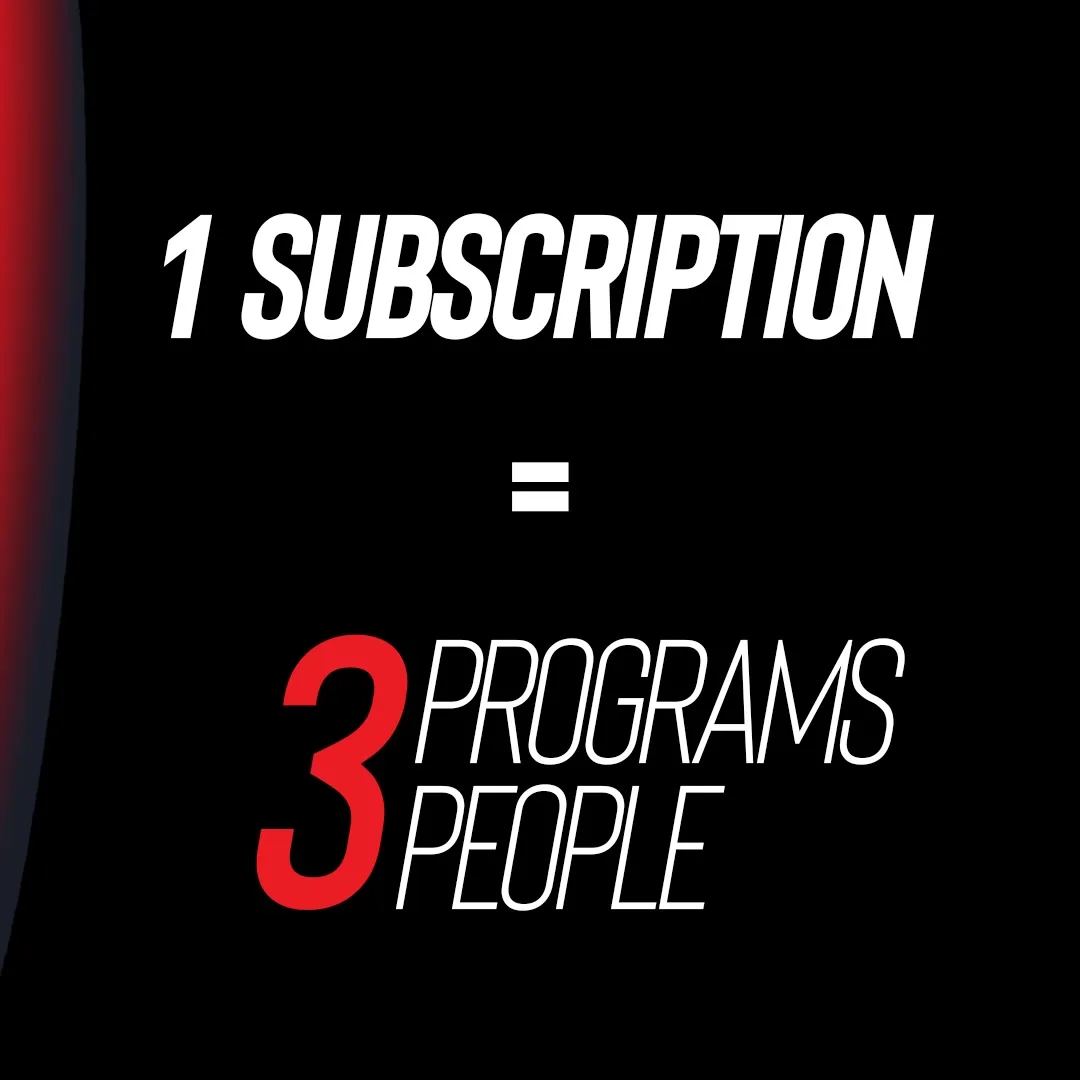
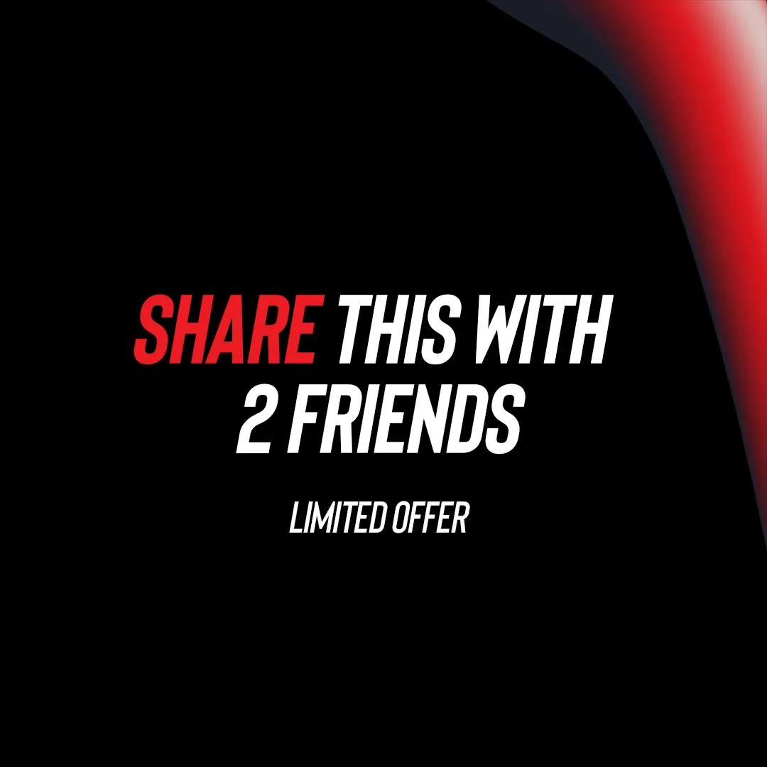
One subscription, three programs, three people, and one instruction to share it. Every carousel here runs all five beats in four to six slides: the difference between a post and a piece of direct response.